I have had the photographs for this review ready to go since May, but I found myself floundering around like an idiot because my appreciation for this fountain pen is entirely based on feeling. On the surface of it, the Waterman Hemisphere is a pretty basic pen. In light of all the inexpensive goodness coming out of Asia, it’s very hard for me to recommend it; which leads us nicely to the incongruity of this review where I tell you that it’s great and I recommend it.
Because it feels nice.
Months of hand wringing and still no real conclusion, yet again I will say that this is a frustrating pen to review. It flies in the face of conventional wisdom when it comes to value. It’s super nice, but totally overpriced when it comes to materials. But then again it feels worth the price. Eugh.
 Waterman Hemisphere Fountain Pen – Amazon / eBay
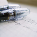
Quality is a very difficult adjective to properly convey across a screen. All pens look decent enough when photographed under proper lighting with the right angles, etc.; but the feel of quality is something the Waterman Hemisphere excels at for an entry (yet mid-end, more on this later) price point. The fabrication is made in France with a level of detail that you just won’t find in cheaper pens when it comes to the fit, and trust me, I own a metric ton of the stuff (damn you, eBay!).

Everything is machined cleanly in a precise industrial sorta way. It’s not polished, but the pen is perfectly smooth, like a rifle (weird analogy, but it works).
It has the same precise click that my Carene does, which lends credence to the notion that this is just the way Waterman does things, regardless of price point.

The only thing that irks me and screams a bit slapdash is the seam line on the section from the injection molding. It’s tacky and Waterman should have polished it out. That said, I can see the same seam line on my Platinum #3776, so it’s not like its unheard of in the mid-range tier of fountain pens. I have kept it as such for the photographs, but it takes 2 seconds with some micro-mesh to get rid of, so I shan’t lose any sleep over it.
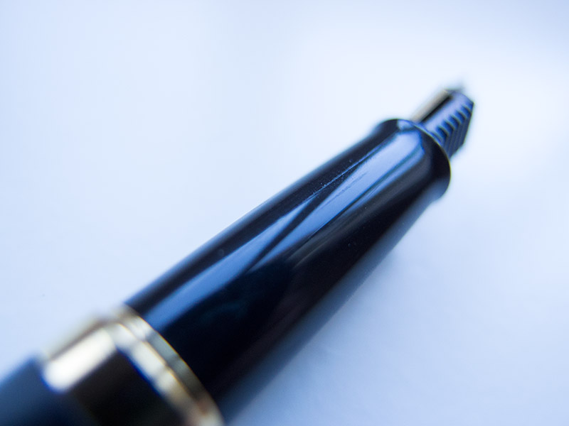
As for the clip, it’s pretty in a very Waterman’ish sorta way. It’s not roughly stamped out, but rather, feels quite solid and high end. Very similar (once again) to all Waterman offerings I have handled.
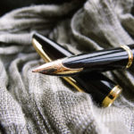
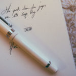
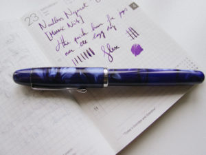
The Hemisphere’s styling is a blend of avant garde and art deco. It works, and I dig it. That being said, the aesthetics might suit me, but repulse others. Regardless of your visual biases, it’s nicely finished if perhaps a bit flashy, but the again the whole pen is understated bling (23k gold plating and hard angles/big bands, etc).

Like all modern Waterman pens, it’s a cartridge converter. I don’t hate that. I don’t love it, but I don’t hate it either. It works, it gives you options, and seeing as I own more or less every Diamine ink ever produced (40+ of them) I like being “forced” to switch inks.
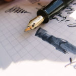
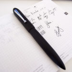
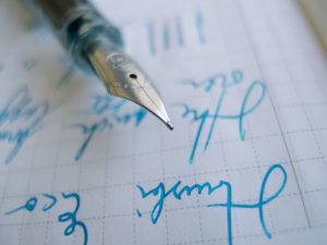
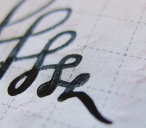
That said, the writing sample is with the standard Waterman Blue ink that it comes with on the standard Tomoe River paper from my Hobonichi Techo (which is exclusively for fountain pen scribble/samples now).
For a basic ink, it had surprisingly nice depth folks. I reckon I might snap a bottle or two up.
 Waterman Blue Fountain Pen Ink – Amazon / eBay
Comfort-wise, the Waterman Hemisphere is a thin pen. I shan’t drone on about measurements, but by modern standards it would be considered lithe. Not an issue, as it doesn’t feature any weird tapering or ergonomic swedges so you can adjust your grip as needed. Needless to say, it can also be posted. It’s balance point is solid- no real biases in the hand. It just feels sturdy and practical, albeit a smidgen thin.
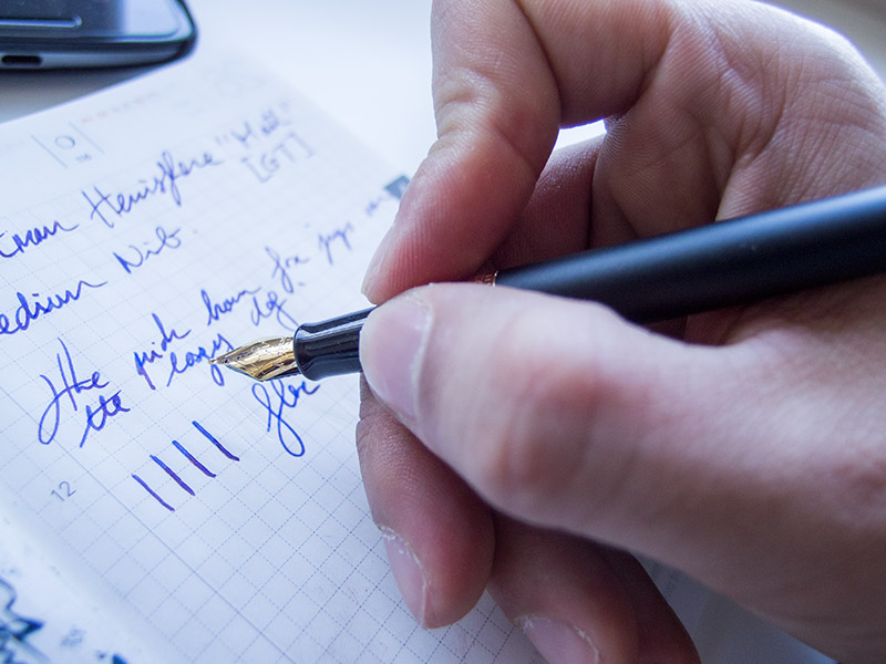
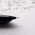
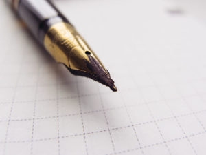
The nib is a chubby steel nib. Its shape is interesting with a very wide flair yet stout length. Performance-wise, it’s legitimately perfect in my opinion. Super wet with “just right” feedback and an ever so slight flourish of character. I own plenty of expensive pens and I wish they came with nibs tuned like that out of the box.
That said, it is steel, but then again, I prefer it to the vastly more expensive 18k gold Carene or Exception nibs that I also own. It has a very distinct character unlike the Carene, which is just a nail; a very nice nail, but a nail nonetheless.

Relative to price, it’s way too expensive. For $20 more you can import a Platinum #3776 from Japan with a more expensive nib (and varied nib options) and objectively superior styling in terms of the appearance of value. Which leads us to a weird thing to consider: can a pen be valuable because you love it? If that’s the case then yes, the Hemisphere is superb value. If you think a pen can only be valuable relative to the cost of materials and construction, it’s really not worth it.
No matter how you look at the Hemisphere, it’s a tough sale. It’s too small to be a flashy/pretty (in a masculine way) contract signer and its too basic to be an art pen. So where does it fit? Sixty bucks for a steel nib, lacquered brass body and a plastic section. Admittedly, all made in France with very crisp precision compared to the Chinese stuff that I have handled.

This is where I have an issue with this pen: I absolutely love it, I love the feel and the refinement, and oh god that nib, but it’s $60. Is it worth sixty bucks? I don’t know.
I know that if I lost my Hemisphere, I would buy another almost immediately, but that’s me and you’re you (hopefully). In tough times like this, I am extremely glad I made the choice to abscond from any reviewing standards, as attributing a number out of 10 for this pen would leave me in a frenzied state.
It feels nice. It’s got a steel nib attached to a lithe frame.
It’s sixty dollars.
Attributing value at this point is going to get philosophical, and so I will leave it at that.


Leave a Reply