The Waterman Carene is, in my mind, the most iconic fountain pen Waterman has ever produced. Its clear naval styling (with its superb nib) display a level of originality that is sadly rarely seen in today’s fountain pen world. We tend to have fountain pens with either gaudy embellishments (looking at you Visconti) or uninspired designs from legacy manufacturers like Platinum or Sheaffer. This sad state of affairs (admittedly, I seem to be in the minority who views this as sad) is remedied somewhat with this offering, and if nothing else, it brings something different to the table.
 Waterman Carene Medium Point Fountain Pen – Amazon / eBay
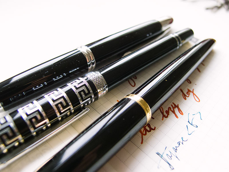
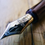
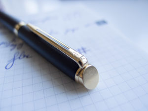
Out of box, the Waterman Carene is a pretty standard glossy black lacquered fountain pen in a sharp cigar body. Its aesthetic flourishes, however, are quite noteworthy. The Carene’s lines are both smooth and reminiscent of a boat or yacht with its nib in particular reminding me of the bow of a ship. The body is made of brass with a lacquer of questionable quality (more on this later), and generally, the fit and finish is pretty perfect with nice, crisp actuation of the 2 teensy tiny clips keeping the cap in place. The trim is gold plated (23k if that matters at all to anyone) and tastefully implemented.
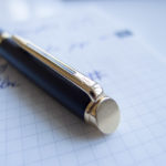
It also has a slanted gold capped finial on the tail of the body. Sadly, I didn’t snap a photograph, as I was too engrossed with photography away at the nib. An understandable oversight taking the nib in question into account!
Speaking of clean, coherent lines – the clip is also quite perfect with no flaws or obvious machining marks. I think, taking into account the price point and materials used, Waterman should be given credit where credit is due with regards to the construction. The Carene is very tight with no apparent shortcomings.

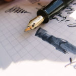
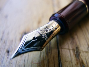
Right, on to the nib – the 18k inlaid gold nib. Do not expect to be able to replace this aftermarket as it’s (I presume) epoxied into the section which is made of some type of high quality plastic. The nib is superbly constructed and quite generous in size. This is not an understated Lamy 2000-style fountain pen. The Carene’s nib is not gaudy or brash, but is definitely loud in its own unique, elegant way. I must commend Waterman on its use of 18k gold for the nib. Whilst I personally don’t care much about the gold content of a nib (it’s personality is of far more interest to me), I do think its gold content boosts its value as far as mainstream opinion is concerned. Taking into account how unique this fountain pen is, Waterman could have put a steel nib on it and still sold quite a few at an inflated cost.

Interestingly, as you can see below, the grip section is where the breathing hole is. Very similar to the Lamy 2000, but in my opinion, is a far more elegant design with no aesthetic compromise. The Carene’s nib width/size is also stamped there as opposed to on the nib. This leads me to believe that the nib is ground after being bonded to the section (please correct me if I am wrong).

Sadly, the filling mechanism is a converter. The quality is freaking out of this world with its smooth squared threading and double o-rings, and the capacity is a respectable 1.30 ml, but I do wish it had a more interesting filling mechanism. I especially think a snorkel would have fit the design of this pen quite perfectly. With that said, my desk pen this week has been a Hero 100 with a garbage squeezy sack mechanism, so frankly – I shan’t complain!

The Waterman Carene is of moderate size. It’s perfectly average with a posted length of 5.80 inces. The pen is viable to be used unposted with a total length of 5 inches and with regards to general balance (in hand) I am somewhat torn. In both cases the balance is not quite right with a slight advantage to unposted, but I think this will be a situation where you will have to handle it yourself. Personally, I use it unposted but your mileage may vary. The grip section tapers down on the Carene, but it’s extremely generous, and I find it unlikely that you would be unable to find a comfortable compromise for your hands.
Just gotta mention again how breathtaking this design is: just look at those lines!

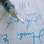
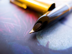
Right, onto the meat of this review – how does the nib perform? Well, the internet is divided on this. It seems to be a lottery with regards to the general characteristics of the nib you will receive. Mine is a “medium” and the lines are bordering on double broad with the nib dishing them out with gusto. Very, very wet. In this review I was using the Diamine Pumpkin ink (Halloween and all that) and it gushed out. It wasn’t uncontrolled by any means, and didn’t leave actual puddles, nor did it burp, but it certainly wasn’t selfish with ink flow. Something to be aware of if you like to write on inferior paper.
In terms of the feel of the nib on paper, the Waterman Carene definitely has a very smooth nib with maybe a touch of feedback. I recently acquired a Waterman Hemisphere, which is almost glass smooth (as good as my Sailor Pro Gear) but regardless, this is still a very, very smooth nib with no performance issues. I will say that the tipping material is perfectly polished with no hard spots so you don’t have to be particularly picky with your angles.

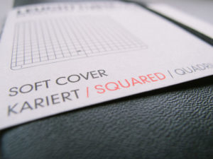
Japanese F compared to the Waterman Carene M below. So yeah, this is pretty drastic. I would say it’s easily a broad and possibly a double broad depending on manufacturer. As you can see below those are some pretty promiscuous swathes of ink. I recommend using the Carene with an ink with some nice shading as the results are quite spectacular. With regards to its writing performance in a professional setting – personally, I have no issues with B or BB nibs, but if you want to lay down a lot of notes that other people have to read – you may possibly want a different pen. The squares, by the way, are 4 mm x 4 mm for reference (from my Hobonichi Techo, which is used exclusively for scribbling it seems).

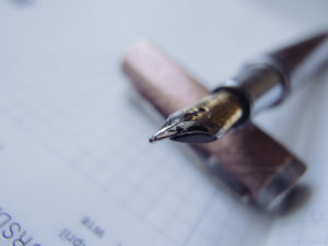
Surprisingly, the nib does have some character. Most reviews compare it to a nail, but I found I was able to get a smidgen of line variation. It’s certainly not a flex nib, nor even soft, but it does possess a touch of sass. Once again, check out how wet the line is!

What I particularly like about this nib is the character of the ink after a few seconds of being dry. Definitely going to be one of my favourite options for doodling.

No skipping of any kind as you would expect from a nib this wet. Interestingly, if the nib had been dry, I am not sure what I could have done to fix it. Definitely something to think about for those of you who like to tinker with the feed; how can you do that when you can’t take it apart?

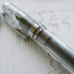
Right, onto the only bad thing I have to say about this pen. Within 3 days of ownership and limited use and fondling, I noticed the lacquer chipped. It’s extremely disappointing and I am not sure if it’s because of a flaw in my specific pen or if the lacquer is just very thin. I own various lacquered fountain pens and have never had this happen before.
As I said, 3 days of ownership – never left my desk and I certainly didn’t drop it, so I am not at all sure what happened. Thoughts anyone?

As you can see below, my Carene’s chipped lacquer is visible, but it’s not obnoxious, so for now I am not too fussed. It helps that the Carene is a relatively (taking into account country of origin, uniqueness, materials, etc.) inexpensive fountain pen and will be a regular user (not a collection piece). That flaw aside, the feel is pretty nice and reminds me of the Hero Greek Key which it sits under.
I own many fountain pens. Very few like to model for me quite as much as this one. Its lines and general design demonstrate a sense of cohesion rarely seen these days. Nothing on this pen is out of place or generates a sense of, “Maybe if this was different…”. It’s quite simply a perfectly put together option with great care having been taken with the aesthetic congruence. It’s beautiful and I applaud Waterman for that alone, regardless of its writing performance (which incidentally, is nothing to be ashamed over).

Is the Waterman Carene worth it? 100% yes. 18k nib (a beautiful nib at that) with a crazy unique and yet elegant design that will never be replicated by other manufacturers (or at least, I highly doubt it). If you like its styling then you don’t really have much of a choice. Much like the Pilot Vanishing Point – if you love it – you will have to buy it. There simply is no “cheaper” (or any) alternative. The materials and construction is top notch with the only flaw being that defect in the lacquer. This, however, seems to be an isolated case, as I have not seen anyone else with this problem. Maybe I will reach out to Waterman and see what they say.
Styling aside, the nib is expressive with lovely flourishes and wetness. If you want a perfunctory writer, I would avoid it based on my experiences, but then again, some people own this pen and found it dry so who knows. Clearly you don’t get Japanese consistency with this model, and frankly, I can’t bring myself to care. It’s pretty and deals out pretty puddles of ink with wild abandon, which makes me happy, and that’s all that matters at the end of the day.


Leave a Reply