J. Herbin is a well known French manufacturer of ink that holds a special place in my heart. I grew up in France, and consequently made glorious puddles with J. Herbin Violette Pensée ink all throughout my early years for my school work.
With that disclosure out of the way, when J. Herbin released the 1670 range with the gold flakes, including this Storm Grey ink, I though to myself that it was a smidgen too kitsch for me and that it seemed to cater to the arty crowd rather than the scribble crowd. Thus, regrettably, I dismissed the line of inks off hand. I understand the appeal of doodling insofar as the use of fountain pens goes. That being said, I personally gravitate toward writing with my fountain pens, and so glittery ink wasn’t something I originally gravitated towards.
 J. Herbin 1670 Stormy Grey Gold Flake Fountain Pen Ink – Amazon / eBay
General Pencil Dip Pen Cork Barrel Penholder – Amazon / eBay
Regardless, that was then and this is now. I finally snapped up my own and I am now a glittery ink user. I couldn’t handle seeing so many photos of the sexiest ink bottle ever and succumbed to joining the horde.
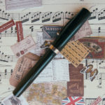
Before I talk about the ink itself, let’s please take a minute to recognise how gorgeous the packaging and bottle design are.
Something to note: I thought the cap was literally dipped in wax and you had to “break the seal,” so to speak, but in reality it’s just a coated cap. You can take off the wax, but there is no need.
Something else to note: I don’t think it’s wax, but rather a plastic adhesive. Or maybe it is wax, but then lacquered after for the sake of durability. Anyone know?

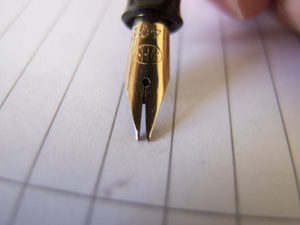
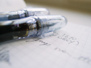
Right off the bat, this is an ink that requires more steps to use optimally than I am used to. The nature of gold dust/flakes means that they will sink to the bottom, as you can see below. To use the ink effectively (as in; make sure it glitters) you are going to have to shake the bottle prior to filling your pen.

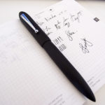
I opted to fill the Pilot Penmanship fountain pen because I am really curious about the impact of gold bits on the feed. Regardless of how you feel about this ink – there is no denying that it makes demonstrators significantly more interesting to look at. An inexpensive plastic pen can magically become quite beautifully detailed with this ink.
 Pilot Penmanship Clear Body Fountain Pen – Amazon / eBay
Here’s my beef: every single review waxes poetics over the ink’s sheen, and sure, it does leave trace amounts of glitter as you scribble. Yet the reality is that unless you are using a 1 mm + italic in a dip pen configuration, you will have inconsistent results. This to me is absolutely fine, but I think it’s misleading to read/watch other people’s carefully thought out reviews which place an emphasis on the sheen. You shouldn’t expect their results to mirror your day to day use. In my experience, they do not.
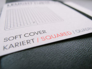
 G. Lalo Toile Imperiale Paper – eBay
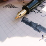
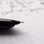
Using a normal fountain pen (for me – EF Japanese), the end result writing with the J. Herbin 1670 Stormy Grey is a pretty grey (heavily saturated) colour with sporadic shimmers once in a while. It isn’t a particularly exciting ink unless you use it with the express purpose of laying down dollops of ink. As far as regular scribbling goes, it’s just a very nice dark grey with a hint of a royal purple. Stormy Grey is the perfect name for it.

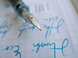
Even with a flex nib, laying down so much ink that my G. Lalo Toile Imperiale paper feathered like a boss, it still looked like a regular ink. This is not a bad thing, but we do have to accept the limitations of having shiny bits floating around, and that it won’t necessarily translate on paper unless you make a concerted effort to squeeze out those shimmers.
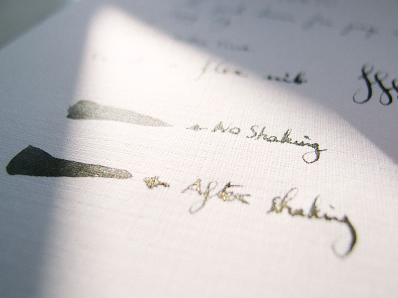
See above. Huge difference and that is with a dip pen. If you want to make sure the feed is always saturated with particles of gold then you will have to shake your pen consistently as you write. The nature of the gold specs means that they will always gravitate to the bottom, which is fine, but if you store your pen tip down, the feed will very quickly choke on gold debris and likewise if you are writing for prolonged periods of time.
It’s just physics.
To clarify, when I say “choke on gold debris,” I have yet to have any ink flow issues. It’s just me trying to find new ways of conveying shiny dust in my ink.

With all that said, when you do get a gold saturated puddle of ink, the results are glorious. I can’t say I am 100% smitten, nor will I use this for regular scribbling, but it adds a different dimension to ink and I can definitely see the appeal. This is a well-loved ink for a reason people. It opened my eyes the same way Noodler’s Apache Sunset did with shading. It’s nice to have sporadic variance as you write.

The sweet spot for me is when the gold bits are interspersed randomly. If the nib is too saturated then it feels like I am writing with a glitter pen. If it’s under-saturated then it’s just a nice dark grey. Once in a while, though, you get a very pleasant deep shading with slivers of reflection, and it’s extremely pleasant to look back on.

I have decided to use this pen with this ink (as a converted eyedropper) until it runs out with zero maintenance in the meantime. I will use it as I would any other ink just to see what impact this has on the feed and nib. Will it clog up? I originally would have assumed so, but to this day it’s still running smoothly, although the nib is collecting gold bits at an alarming rate, so we shall see.
In any case, J. Herbin does explicitly state not to “leave the ink in the fountain pen reservoir.” I am not 100% sure what they mean by that as I don’t think it’s pragmatic to expect the fountain pen wielder to flush and clean after every session, but then again they may have erred on the side of caution for liability reasons (edit 2017/07/31: they did – update here and final update here).
Doesn’t matter though. It’s common sense that if you use this ink, there is a chance for clogging up the feed. We are talking about a liquid chock full of floating bits of gold people!
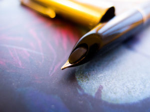
As you can see below, the gold does like to accumulate at certain sections. It’s not like the flakes are dispersed throughout evenly. Something to be aware of, but as I said earlier, I am not going to treat this ink any different in this pen, and once I have used it up I shall do a thorough autopsy and we shall see what the end result is/was.

J. Herbin’s Stormy Grey is a very unique ink, and for that alone they should be applauded.
I know Diamine make a similar version these days, but it always takes one to make the first step, so if nothing else let’s applaud J. Herbin for bringing something new to the market regardless of our own personal biases against glitter.
For me personally, as I’ve said, I don’t use my pens as glorified paint brushes. I am not throwing shade here, if you like making art with fountain pens then go for it! But as such, this ink has limited appeal for my own uses. I don’t think I would dare to use it in a pen that’s problematic to disassemble or if I can’t access the feed (looking at you Waterman Carene!), but admittedly the ink has grown on me.
Unlike the bulk of people, I prefer using it in an extra fine. The ink itself is beautiful and the finer line width means the gold (which could be construed as quite garish) is far more subtle in an extra fine, which works for me and I can definitely say it makes using my fountain pen more interesting, especially when I am writing notes for work or filling in my planner.


Leave a Reply