Oxford is a well known brand of stationary in the UK. Growing up, it was basically the standard at school, and whilst it’s not known for catering to trends, it does have a reputation for decent quality at a decent price. When I saw this red Black n’ Red A5 journal on Amazon, I took a gander over to check it out.
Sadly, the Black n’ Red is deeply flawed for the same reason that most supermarket/office brand papeterie is deeply flawed: it takes a good product, adds mediocre branding and weird construction solely because its different. Then, too late, the company realizes all the crap they did costs money, so the end product becomes far more expensive than it should be. It’s like these companies just love to fight against themselves.
What bugs me about all these “office” type companies making hipster stationary is they don’t seem to understand the market. Or maybe they do and I am just a spiteful outcast ranting at quirks everyone seems to be fine with, who knows.
 Oxford Black n’ Red A5 Hard Cover Notebook – Amazon / eBay
The crux of the issue with notepads such as the Oxford “Red” By Black n’ Red (holy shit that name…) is that it seems to me they saw what Moleskine did, realized there was money to be made selling to coffee shop scribblers, and decided to ignore what makes Moleskine/Midori, etc. popular and instead stuck to old school construction, but slathered in awful branding.
Feels like it was designed by someone who works in marketing and scribbles on a Macbook Air, not a notepad.

Alright, enough shade has been thrown (for now). Now let’s discuss what the actual problems are. The Oxford Red (I shall refer to it as such from now on as I am not a masochist) is an A5 hardbound notebook with extremely nice vellum paper in the 90 gsm range.
I would wager 3 bottles of Fairy Liquid that the paper is made by Clairefontaine. They don’t advertise it as such, but the quality and finish is so similar that I point blank refuse to believe there isn’t a connection.
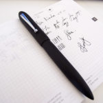
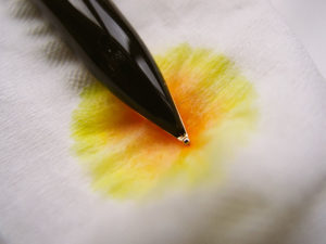
The quality of the paper, by the way, is the best thing about this notebook. As you can see below, it handles ink decently well when you take into account that it’s supposed to be a cheap notebook for everyday scribbling.
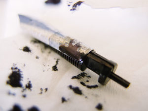
Some bleedthrough with super wet nibs and the ink splatter didn’t take nicely, but all in all, I would say it’s decent.

No feathering and extremely smooth. 100% convinced its vellum-style paper. Oxford advertises it as Optik paper, and you can buy it in much cheaper formats (which I would recommend as opposed to this slab of shit), but ultimately, it’s the equivalent to a Clairefontaine standard 90 gsm option.
 Sailor Slim Pro Gear Fountain Pen – Amazon / eBay
The construction is designed to look nice from the outside or for small toddlers who want a nice ground up notepad but don’t actually write extensively.
I write professionally and consequently go through mounds of paper and thus my standards are much higher. I understand that this makes my bias a smidgen more extreme, but this is my blog and I write from my perspective.
As you can see below, a lot of wasted material and weirdly glued construction along with the standard thread bound you would expect. The notebook itself is oddly substantial, which is the standard for mediocre construction trying to pass as high end.
Fit and finish is questionable. The back sleeve doesn’t line up. The the cover page is glued to the inner sleeve at an angle and looks ridiculous.
All in all, I am not impressed and I see no reason why I would use this compared to a Midori which is better made and cheaper.

Now onto the aspect I hate the most: the branding.
Oxford, I’m sure you’re probably proud to have a product on the market that in theory would be considered cool based on its target demographic. But guys, honestly – you do office and kids stationary. If you are going to go the hipster route – mayhaps higher a different designer?
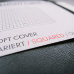
Weird leatherette cover with reptilian texture and enormous Black n’ Red embossed on the front of the notebook as well as a gaudy giant “R” on the reverse.
It’s so hideous I just don’t understand how it came into production. Do these people have a meeting where they can handle the product prior to launching it? Who okayed this?!

The greatest scam this century has been shitty clothing companies turning us into walking billboards. I am buying a product, not offering myself as a living, breathing marketing shill. I know that this is a huge double standard as I have no issues with the Montblanc snowcap, but I think branding can be tasteful. When it comes to the Oxford Black n’ Red series, it’s slathered on in a way that is simply jarring and exists not to accentuate the design, but rather to shout to everyone around you, “I bought this from X and you should, too!”
Eugh.
The designer of this notebook clearly looked at what Sportswear companies did and thought; “Mhmm, why not?”
Perhaps it works and I am just unusually sensitive to shitty branding, but this just offends me (I know, I know, I am a snowflake). Still, if the cover was plain card with zero branding, zero features, and maybe 3-4$ cheaper – I would be recommending this notebook instead of slamming it.
Frankly, if every page has your stupid “R” logo in RED on the bottom, then I expect you to pay me to use your product, or at the very least subsidize the cost to the consumer.
/rant

What were they thinking?
Money, money is what they were thinking folks. Ramming a brand down our throats until we the consumers associate their shitty branding with notebooks.
Thankfully, a zillion notebook companies exist and thus it has elicited the opposite reaction (to me at least). Midori has almost no branding and the little branding it has is tasteful and accentuates the overall design.
Take note Oxford, or stick to kids’ exercise books.

Expensive design with mediocre materials and construction. Too much “stuff” designed to add weight and feel like a luxury product, but in practice is badly implemented. The card stock is super thick, everything is super thick compared to most other companies and yet all it has is 144 pages.
Just weird.

That said folks, the paper is way above average. It’s lined nicely and the pages are numbered, which is very useful for some. The sample below is done using a broad italic that dispenses ink as voraciously as Trump dispenses tweets. The lack of feathering is impressive and I once again stand by my belief that the paper is sourced from Clairefontaine.

Right, so I reckon I covered the gist of it. Great paper, but poorly manufactured notebook (relative to price) and obnoxious branding that even my sexy camera can’t overlook.
This option would have been fine 20 years ago when notebook variety was slim pickings, but it’s 2018 and I am literally drowning in sexy minimalist (Midori) or tastefully opulent (Smythson ❤) options.
Reviews should not exist in a vacuum. We cannot form an opinion on a product without looking at the alternatives, and faced with competition – the Oxford Black n’ Red – “Red” fares poorly.


Leave a Reply