Reviewing this memento from history has been a tricky proposition for me. Reviewing vintage pens that are not focused on aesthetic presentation (Conway Stewart Dinkies for example), but rather performance, is always tenuous.
Do I review it as if it was a modern Lamy? Or do I look at it with nostalgia and consequently gloss over its faults and perceived value?
Ultimately, I just gave up. This review, I hope, will be useful for you, but will contain my own biases and lack of obsession with the history of the Parker 51, whilst still enjoying the fact that it’s a classic pen and deserves to be discussed, even if it is a smidgen over-hyped.

On a practical level, the Parker 51 is a solid workhorse pen, but – as I’ve already stated – its primary appeal is its history and lineage, and it would be silly to ignore that.
I am not a Parker or a thematic collector – I just like pens – so I have no real interest in talking about every little detail. Plenty of other reviews cover those points in depth if you are so inclined.
As for the pen as a tool? On the surface, it’s a basic bitch. What you see really is what you get in terms of feel and materials.
Plastic body and section with a nice (firm) gold nib. The pocket clip is less defined, and yet prettier than modern Parker pens and the general style is understated. Minimalism with a capital M.
Nothing wrong with that at all; this is a pen for people who write with pens.
A lot.

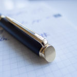
The only real flourish is the weird cap cabochon. It’s made of a pseudo-translucent material that’s glass-like and I do like it; not because it’s well-made or finished, but rather due to its rougher/machined construction.
This feels like a pen that was made properly. It offers a surprising amount of heft, and the construction is lithe, yet chunky. Solid bits of steel are seemingly welded together with some surface finishing that by modern standards is a bit slap dash.
I personally prefer that. Much nicer to have an old saucepan with a heavy bottom and welded handles than the modern stamped alternatives. This old fashioned way of doing this provides an interesting contrast with modern Parker pens that are more or less dog shit. A modern Parker Frontier is a cheap pen that feels cheap. Everything is stamped and injection molded with cost as the primary concern.
This is a plain Jane pen, but feels reassuringly stern. I would wager that despite its age, this pen will stand the test of time better than 99% of modern equivalents, and you would be hard pressed to find someone who disagrees with my position.

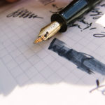
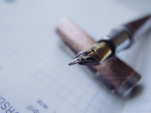
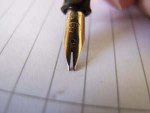
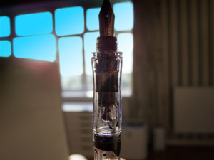
The nib is hooded (obviously) and gold (14k). A nice arrow is inlaid in the section and beyond that there isn’t much to talk about. It writes superbly with clean lines, no railroading and the filling mechanism (sac & pressure bar) works, but is limited in both capacity and feedback. I don’t like aerometric style sacs because of the feel you get. Give me a cartridge/converter or piston any day of the week instead of a squishy rubbery thing.
If this pen was a piston filler, I would have zero reservations about how over-hyped it is.

The only adornment on the body is the metal ring that mates the body with the grip section. It has a single, well machined groove in the center to hug the cap tightly. In practice, it works great and I am a fan. Very solid option to take out in a coffee shop to doodle with.

Over 50 years old and it looks it. Everything is thick, clean, deep branding with a sense of structure and purpose. I have a lot of pretty pens and whilst I don’t “get” the appeal of the 51 aesthetically, I can definitely appreciate it based on its construction and finish. I have a more modern Parker (but still vintage) Victory and it feels almost cheap compared to this 1940’s Parker 51. It’s depressing to see how machining standards have dropped due to economic constraints. “Why make a cap thick when it can be thin with a plastic insert?” is the modern approach to construction, and that’s a damn shame.
Hold a 51 and you will understand the difference. The superficial few grams of steel doesn’t add much to the cost, but stamping and creating thicker parts is more expensive in terms of tooling and machinery. This is why current generation of metal caps are so puny and frequently made of brass instead of steel. Brass is heavy and easy to work with which gives the illusion of strength whilst steel at that thickness is literally bombproof.

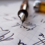
Writing performance is interesting. The nib is plain with limited bounce, but the feedback and subtle line variation (mini-stub?) does give you that true “fountain pen” cursive look. Writing with a modern Parker feels like writing with a very wet ballpoint. This is a different kettle of fish altogether, very precise lines with pleasant resistance that bring you back to a day when people actually scribbled letters.
I am pretty smitten with it actually and I do wish modern nibs displayed such character as standard.

Naturally, it has zero flex. If you crank pressure down it will bounce a smidgen, but I wouldn’t advise it. The grip section is average. You know I don’t spout measurements on this blog (so boring), but ultimately this is just an average pen insofar as size is concerned.
The section does taper down which I am indifferent towards. At the end of the day, no one (as far as I know) has ever wielded this quill and complained about ergonomics. It’s light, balanced, and average.

As I mentioned before, the nib does have character in a mini stub sorta way. Looking at the tipping on the nib I don’t detect any modifications so I assume this is just the way it was and based on some other writing samples I have seen, this is more or less expected.
I should mention that I write very fast. I don’t do calligraphy for the sake of pretty swoops and my writing samples reflect that. At no point are my scribbles carefully measured and considered. I wager that if you wrote super slowly and carefully you would lose a lot of that character.

As I wrap this up, I think it’s fair to say that the pen is a basic workhorse that’s nigh unbreakable. Couple that with its better-than-average nib and I think the fountain pen world’s obsession with it is understandable, if not justified.

I think a lot of times reviewers try so hard to present an objective opinion that they limit their own critical reasoning skills and I have found myself being sorta stuck with this review. I am not qualified (or frankly, interested) to heap historical blurbs about this pen and I can’t objectively say that it’s the best pen ever just because so many people love it.
The reality is that 20 million of these tykes float around the world, a significant portion of which are still used everyday as intended. Regardless of where you stand on the Parker 51 debate, this is a noteworthy achievement and we should give the pen proper praise for its place in history.
This is a special pen and regardless of your knowledge of its roots – it does feel special. Then again, the filling system, whilst adequate isn’t great. Also the price point is only really attractive as a consequence of the gold nib – not because the pen is inherently good value. Then again, modern Parkers are shit value, so it’s hard to gauge its worth.
Character is subjective and so will be your appreciation for the Parker 51.
My advice and ultimately the conclusion to this is to simply buy it, give it a shot, and if you don’t like it you can sell it for the same price or more. Can’t say fairer than that can we?



Leave a Reply