I absolutely love snapping up budget pens in the under $25 range because they universally have at least one feature that is super impressive, while having so many downsides that are so easily avoided, I almost stagger back from the stupidity of it all.
Why would I love this? I genuinely prefer penning reviews where I can bitch. As many of my friends can attest to: I am a Negative Nelly, and thrive when given the opportunity to be thoroughly spiteful. I shan’t make any apologies for it, and if I’m honest, I feel it means when I finally do have something nice to say about an item it has more “oomph” as a consequence. Considering this preamble, I’m sure you’ve put together that not much “nice” is on the menu today.
The Wing Sung 698 characterizes Chinese fountain pens in 2017 down to a T: some interesting quirks wrapped in piss poor branding and questionable aesthetic cohesion.

To this day I do not understand why Chinese manufacturers when presented with a decent base model think to themselves, “Yeah, it’s nice, but if we throw a bunch of garbage shit on it then it will be better.” Wing Sung/Lucky/Wings (all the same company) is particularly guilty of this design sin.
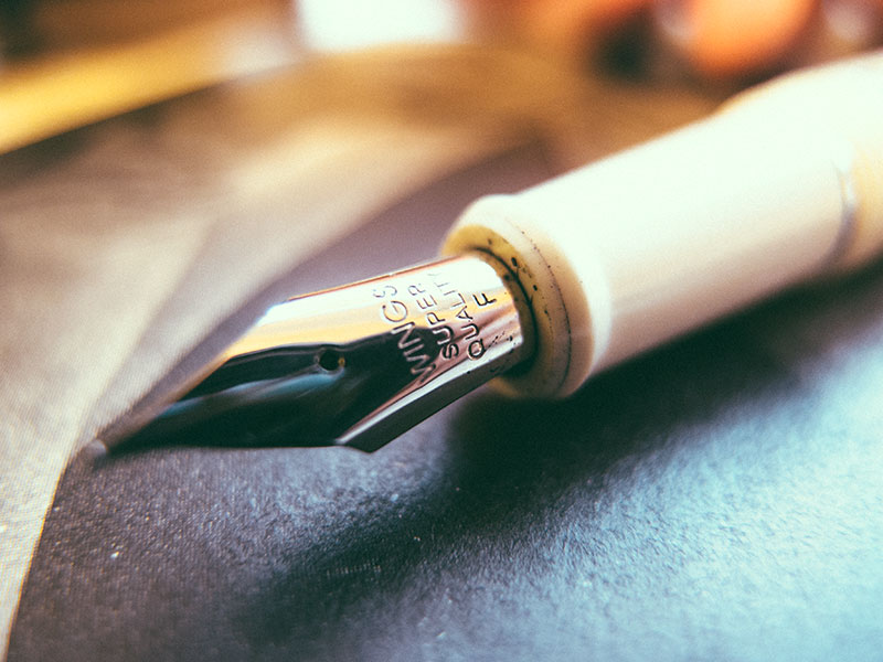
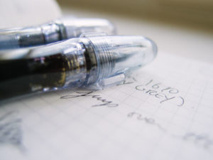
One reason I like Jinhao pens beyond the standard consistency is the more Western branding choices. The Wing Sung 698 has zero consistency when it comes to branding. As a matter of fact, this Wing Sung doesn’t even say Wing Sung on the pen, nor does it have a logo – just bizzare off putting slivers of chrome gaudiness, as can be seen below.

I find this particularly offensive because this is actually a great pen, with a ridiculously pleasant nib. The garish branding exists for reasons no one understands as they add cost to the manufacturing and yet damage the style of the pen to the point that in my eyes its worthless.
If they made it out of that lovely cream plastic with no finial and naked bands (except maybe a small “Wing Sung” laser etched perhaps?) it would be stylish and timeless, but instead we have as super shiny starburst finial, a clip with “LUCKY” stamped across it, a cap band with “WINGS [Chinese characters] 698” and some bizarre log on the piston which I presume is to indicate that we should pull and twist?
No idea.

I just don’t understand why manufacturers would spend time and money making a product worse. The mind boggles over the sheer stupidity of it all.

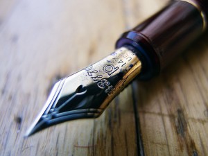
Full disclosure: I am making a pretty big leap insofar as assumptions go with regards to the nib.
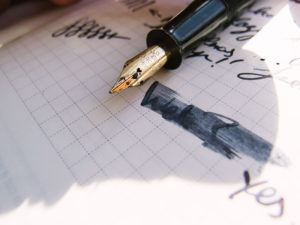
This is (I am 99% sure) a Pilot nib made by Wing Sung on ex-Pilot machinery. This theory has been floating around on the internet for a while, but after using it and comparing it with a bunch of my steel Pilot nibs, I can attest that if my eyes were closed – I wouldn’t know the difference.
Superb feel, almost Sailor levels of glassiness and unlike buttery Jinhao’s, it still has that precise bite that F width Pilots have. I am beyond impressed and frankly for something like $20, it’s pretty damn awesome.
I didn’t bother flushing the pen before I used it because frankly, I shouldn’t have to. I will “clean/adjust” a pen if I need to and report back on Scribble Jot that it didn’t work out of the box. Beyond that, my experiences are always out of the box.
The feed itself is similar to what you would find on a Pilot Penmanship. I would wager that they are interchangeable and the performance is beyond reproach after a few seconds to let the ink saturate the feed.
A smidgen on the dry side, but then again this is on Midori paper and it’s pretty damn absorbent compared Tomoe River or Vellum paper – on those I would say it leans on the wet side of things. But beyond that, it’s super pleasant to use. The grip section is neutral and of decent size and thus the nib can do its thing without the pen getting in the way.
Just lovely to use – I don’t have a single criticism.

Should be noted that this is for taking notes/scribbling only, for doodling/artistic swathes of inky goodness, the feed won’t keep up. For writing, though – it’s a real workhorse.

So really what you have is a top shelf nib, a standard (decent) piston mechanism and a neutral body in a nice plastic that has been spoiled with cheap trimming that looks tacky in a way that only the Chinese can really excel at.
Kudos, especially as the manufacturing is sturdy and decently put together. Managing to make it look cheap is an achievement at this point!

On the note of manufacturing and tolerances, this is definitely above average with a piston that pops out with a satisfying click and very smooth threading. It came with a lil’ bottle of silicon lube which is a nice touch.
If you write reams on the daily, this is a decent high ink capacity option. Personally, I like to switch inks regularly so this isn’t much of a selling point, but that will always be a point of contention amongst us inky lot.

Oh and it has ink windows that barely work, which I guess puts it in the same league as its Western (Pelikan and Montblanc) contemporaries.
Balance is solid, not much to say about a plastic pen. It’s light and neutral, will handle exactly as you expect it would. Waxing poetics over that just seems silly and a waste of words.

So here we are. Piston filler gaudy Pilot for less than 25 dollars is my general conclusion.
I recommend the Wing Sung 698 as a workhorse that you don’t have to feel guilty about trashing, but beyond that the aesthetics are jarring. The cream plastic is lovely (in my opinion), but the thick chromed branding and obnoxious cap finial just puts me off and I don’t like having it out on my desk.
Make of that what you will.

Leave a Reply